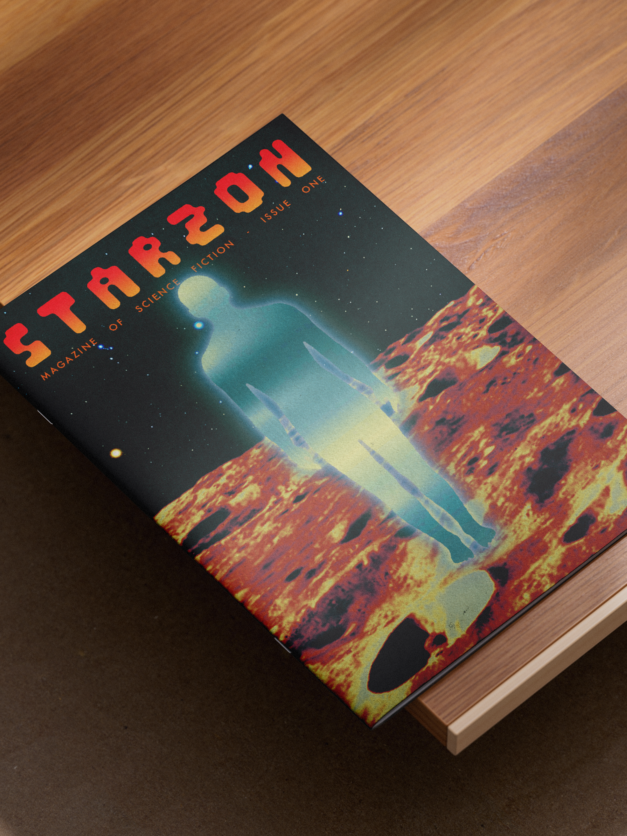
This was a mock-project trying to show off my versatility as a designer. My aim was to create a range of visual styles through the medium of the poster imagining mock tour and festival posters.

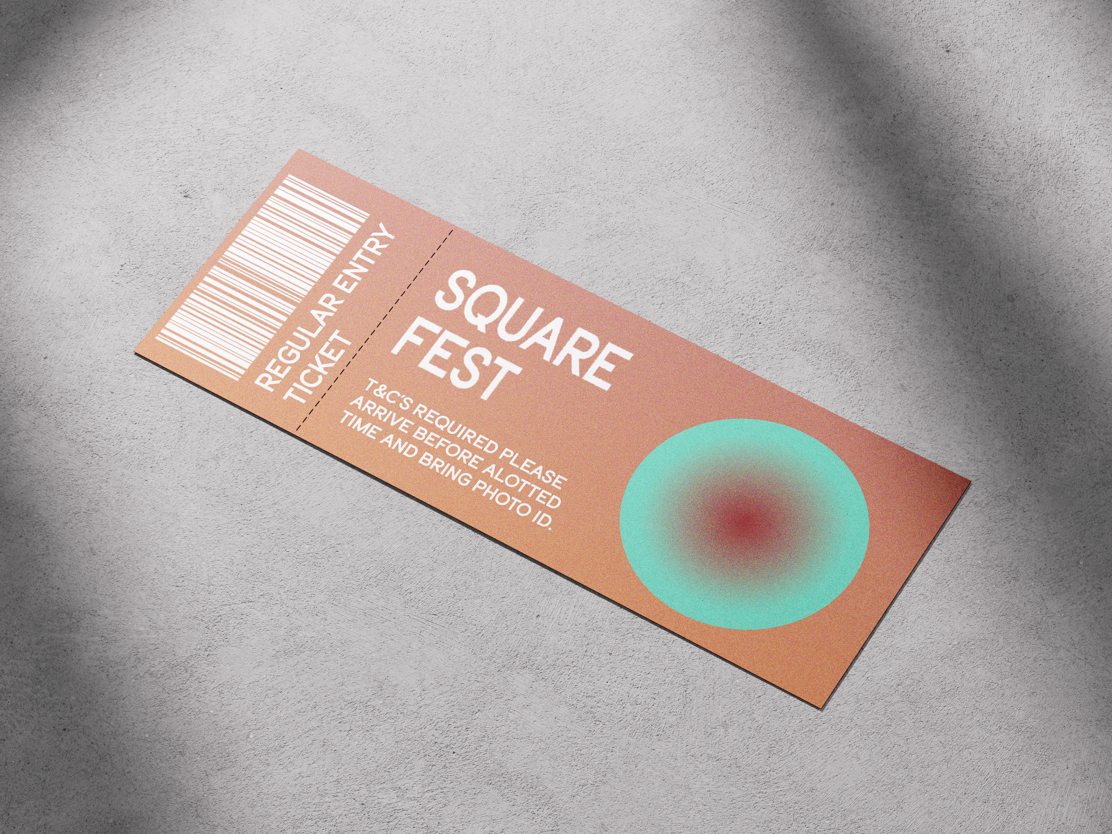
After going through several iterations, I wanted to create something that had a stronger identity and a distinct visual feel. I decided to take the design shown above further and develop it into a full visual identity for a festival.
This included refining the typography, developing the soft gradient as a core visual element, and considering how the identity could extend across different touchpoints. I explored how it would translate onto tickets for the event (as seen below), ensuring the design felt cohesive and recognisable beyond just the poster format.
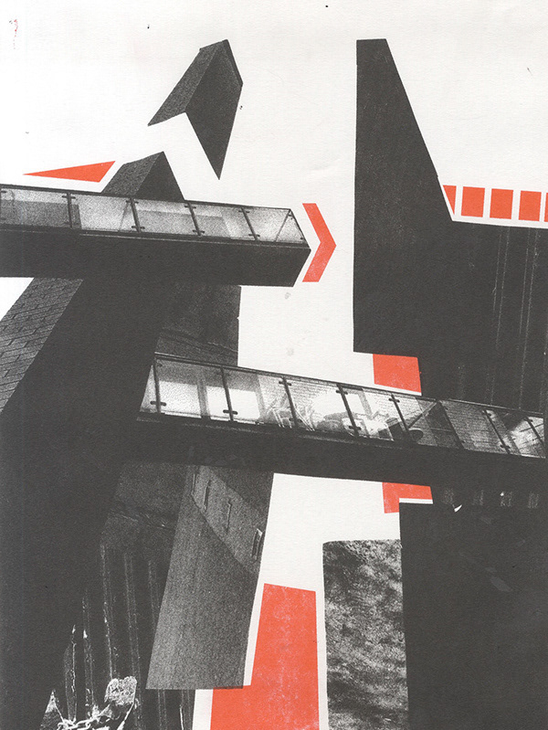
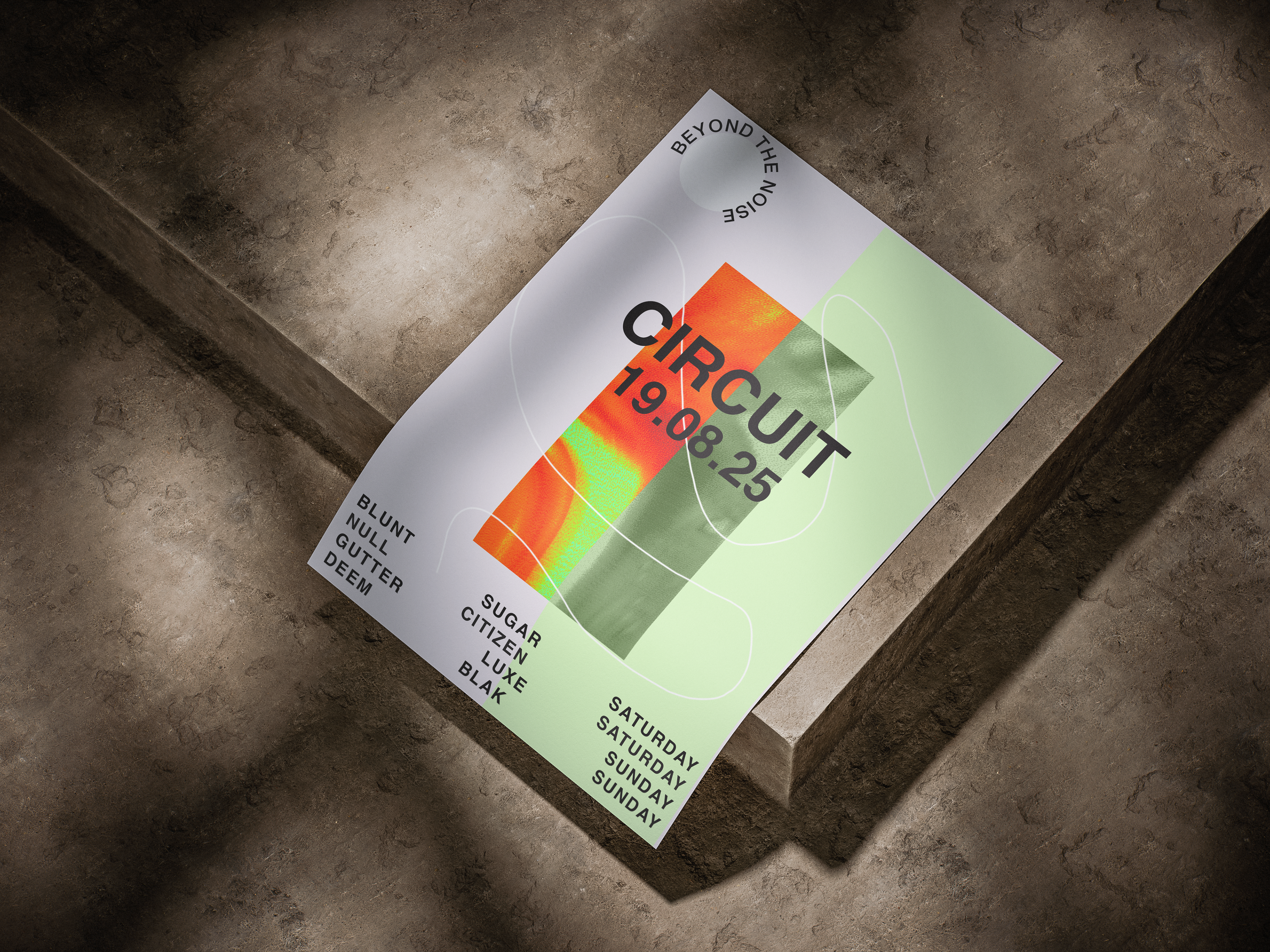
The designs below show alternative poster iterations that I developed to a lesser extent. While they are visually interesting, I felt they were less successful in establishing a strong and consistent design language.
That said, they were an important part of the process. I wanted to explore a range of genres and styles, experimenting with how different visual directions could be incorporated into a cohesive design approach. This stage allowed me to test ideas more freely before refining the final outcome.
Work type: Branding, Digital Artwork Programs used: Illustrator, Photoshop

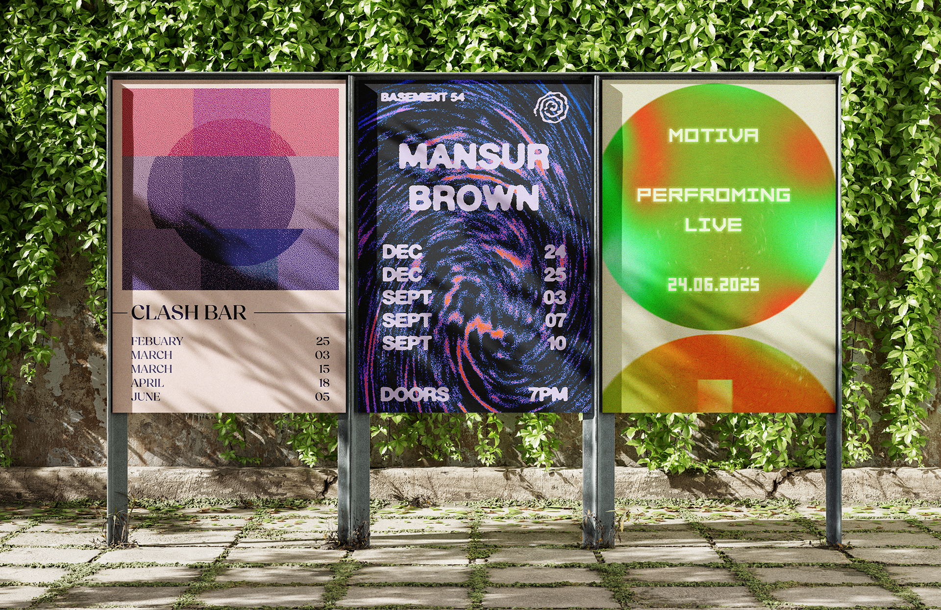
These were some other miscellaneous posters for a variety of genres.